Making a Cleaner UMAP Plot
Your UMAP Doesn’t Look Good
Sorry, but it doesn’t! But that’s OK, you just work in an industry that prioritizes quick results over aesthetics. The default UMAP plots from scanpy and Seurat are certainly serviceable, but no matter what journal you publish in, you deserve to have a clean-looking plot that more effectively communicates your data!
I know lots of people spend their whole lives perfecting data visualizations. I am not one of those people, I am just an opinionated researcher with a bit too much time on my hands.
Why does this matter?
There’s a story I think about a lot. In college I took a classics course, and the professor asked us why there was all of this ornate architecture around campus. Baylor is an old university, especially for Texas, and so it has a very old style of architecture. Our professor explained to us that the spires on top of the buildings, the iconic deep red brick, and the incredible detail all were meant to inspire. Beauty is inspiring. It makes us think deeper and dream about what is possible. Believe it or not, I sometimes feel the same way when I look at a really beautiful plot.
What’s wrong with my UMAP?
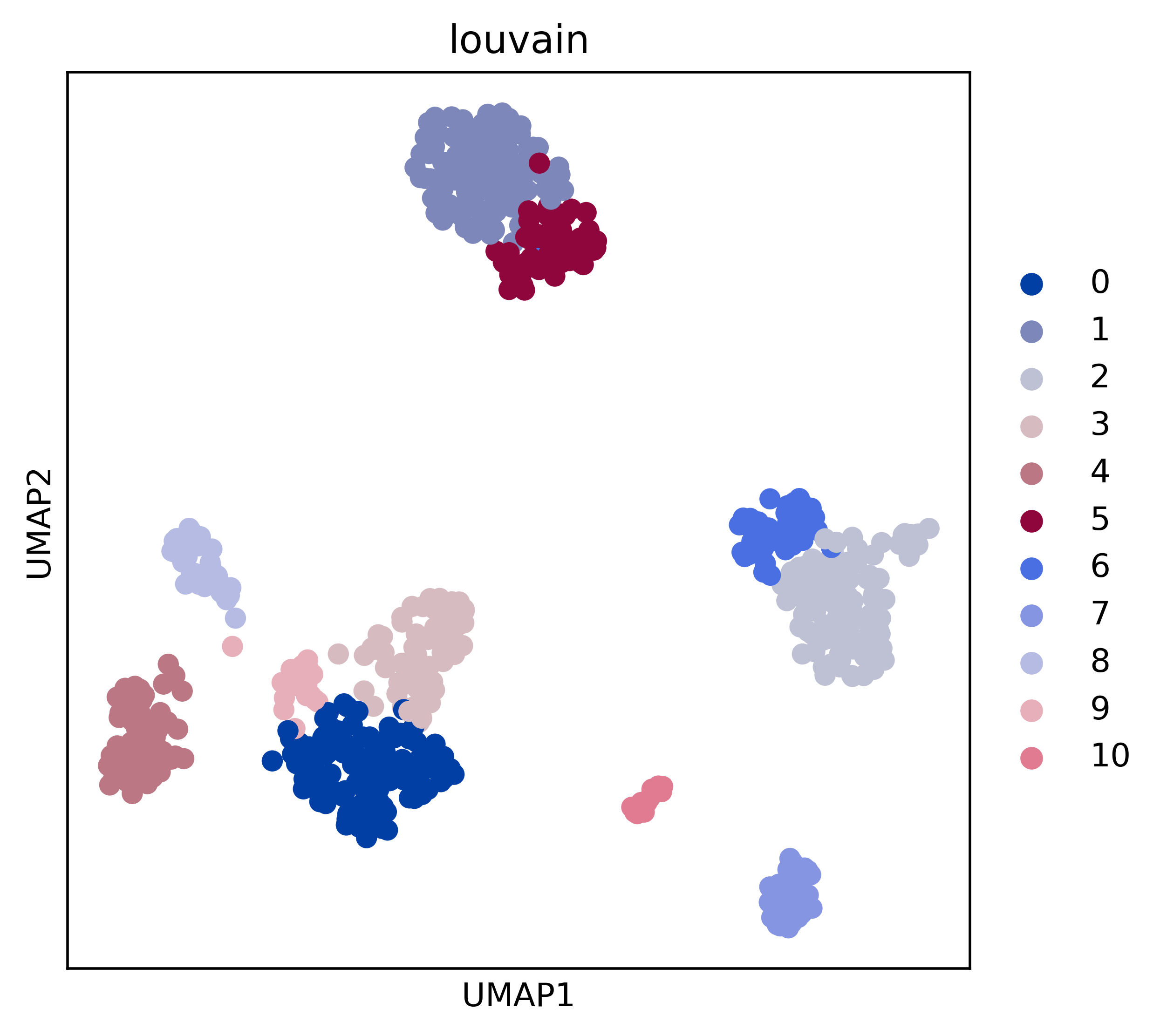
Wrong might not be the right word, but they certainly don’t look good. For example, if I just make a very basic plot of some Louvain clusters from the PBMC68K dataset like so:
import scanpy as sc
import matplotlib.pyplot as plt

# %%
adata = sc.datasets.pbmc68k_reduced()
umapEmbeds = adata.obsm["X_umap"]
clusterNums = adata.obs["louvain"].to_numpy()
# %%
fig, ax = plt.subplots(figsize=(5, 5))
sc.pl.umap(adata, color="louvain", ax=ax)
ax.get_figure().savefig(
    "./figures/exampleLouvainDefault.png", dpi=500, bbox_inches="tight"
)
I get a plot that is serviceable for sure. I see the clustering and I may get some ideas about where to go next in my analysis. There are some problems (to me), though. The first is the color scheme has multiple colors which are very similar in shade. It needs a qualitative color scheme. The second is that it just looks…kinda ugly. Louvain isn’t capitalized. There’s no legend. And it certainly doesn’t evoke a sense of wonder (maybe that’s too far).
Seurat has other issues, especially for a package named after a painter. Everything about those plots, from the blaring UMAP_1 with its underscore to its units on a unitless axis, make me wince.
So let’s do something different. Let’s make a plot that:
- Doesn’t use units
- Has informative labeling
- Uses distinctive colors
- Maintains a clean aesthetic
To do this, we’ll shorten the axes to be arrows. No tick marks are necessary because UMAP is a non-linear dimensionality reduction method. This is the crux of most of it, outside of ensuring our font sizes are approriate and all of the basic data visualization guidelines. This requires some Matplotlib trickery, though, so watch out. I think it self-documents fairly well, first by instantiating a plot, plotting the actual data, swapping the axis lines for arrows, then finishing up the labeling. Here’s the code:
# Assumes you're using the data from above!
# Variable text size, movement of text from the axis, and proportional length of arrows
fontSize = 10
axisSep = 0.2
arrowProp = 0.15

fig, ax = plt.subplots(figsize=(5, 5))
cmap = plt.get_cmap("tab20")
cmap = list(cmap.colors)

# Plot clusters
uniqueClusters = sorted([int(clusterNum) for clusterNum in set(clusterNums)])
for clusterNum in uniqueClusters:
    isCluster = clusterNums == str(clusterNum)
    ax.scatter(
        umapEmbeds[isCluster, 0],
        umapEmbeds[isCluster, 1],
        c=cmap[int(clusterNum)],
        s=10,
        label=clusterNum,
    )

# Remove axes/ticks
ax.spines[["top", "right", "left", "bottom"]].set_visible(False)
ax.set_xticks([])
ax.set_yticks([])

ax.set_xlabel("UMAP 1", loc="left", fontsize=fontSize)
ax.set_ylabel("UMAP 2", loc="bottom", fontsize=fontSize)

# Put labels at origin with some small separation from arrows
xmin, xmax = ax.get_xlim()
ymin, ymax = ax.get_ylim()
ax.xaxis.set_label_coords(xmin - axisSep, ymin - axisSep, transform=ax.transData)
ax.yaxis.set_label_coords(xmin - axisSep, ymin - axisSep, transform=ax.transData)

# Add arrows
arrow_len = arrowProp * (xmax - xmin)
head_size = 0.015 * (xmax - xmin)
ax.arrow(
    xmin,
    ymin,
    arrow_len,
    0,
    fc="k",
    ec="k",
    lw=1,
    head_width=head_size,
    head_length=head_size,
    overhang=0.3,
    length_includes_head=True,
    clip_on=False,
)
ax.arrow(
    xmin,
    ymin,
    0,
    arrow_len,
    fc="k",
    ec="k",
    lw=1,
    head_width=head_size,
    head_length=head_size,
    overhang=0.3,
    length_includes_head=True,
    clip_on=False,
)
ax.set_aspect("equal", adjustable="box")
ax.set_title("PBMC 68K Louvain Clusters", loc="left")
fig.legend(markerscale=2, fontsize=fontSize, loc="center right", bbox_to_anchor=[1.1, 0.5], title='Cluster')

plt.savefig("./figures/cleanerUMAP.png", dpi=500, bbox_inches="tight")
And here’s the output:
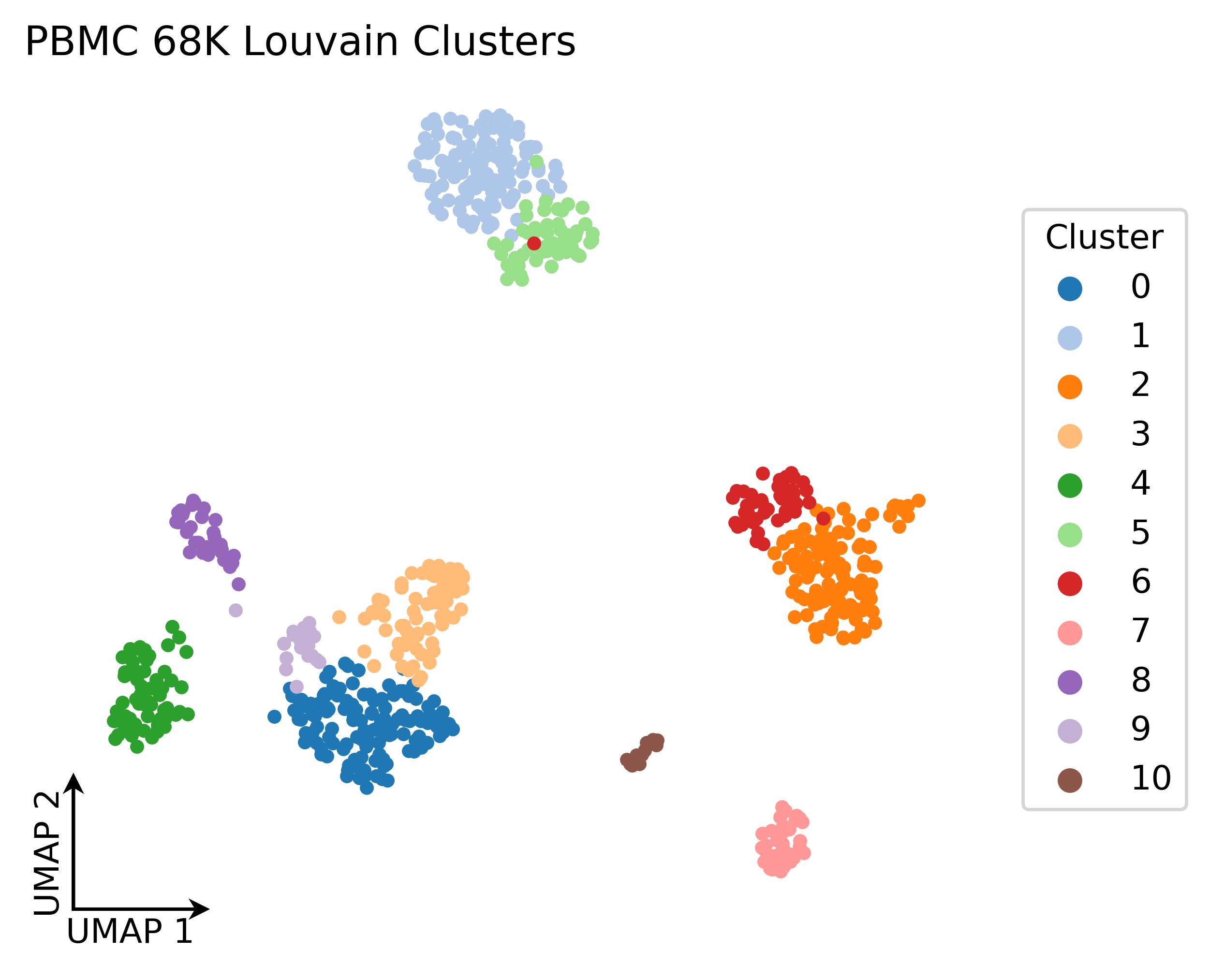
For my money, this is a much better plot that accomplishes our goals. The code might be longer than if we just blindly plotted everything, but the actual programming bit is only about 9 lines here. I’d also recommend playing around with your own color scheme. Some UMAP plots, especially in the single-cell world, need darker colors from a qualitative palette in order to get proper contrast. The rest is fairly standard. You can play around with some of the variables at the beginning, but for the most part everything can remain static.
It’s a short one, but hopefully you can see how just a few changes can make a plot look much better.